Cohort analysis
This report lets you select groups of users (cohorts) and track metrics of completed events for the selected period of time in the cohort. You can use the report to assess the quality of traffic sources and the quality of the audience produced by media sources. Also, the report allows you to analyze how many users have completed an event in the selected cohort. In this way, you can calculate the users from a particular partner.
The report allows you to select specific users using segmentation. For example, those who made a purchase in a specific region. LTV metrics can also be viewed by cohort. The period for the target action in the report is also set using segmentation.
General settings
To build a report, select:
-
Time period.
-
Analyzed metric. By default, the report shows the dynamics of the "App Launch" event after app installation (day 0), the next day (day 1), the day after (day 2), and so on.
-
Cohort size - time range: day, week, month, or custom range.
Setting a range
Using ranges allows you to group days into intervals that are convenient for cohort analysis. Intervals are displayed in the table and on the chart as separate columns with corresponding labels.
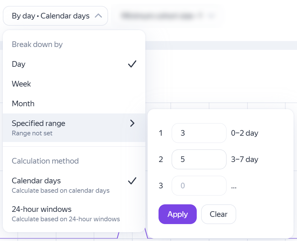
If the specified intervals exceed the report period, the extra parts are truncated. If the specified intervals don't cover the entire report period, an additional interval is automatically added to cover the remaining period.
For example, ranges are configured: 0-1, 2-4, 5-10.
-
If building a report for a week, it will show intervals 0-1, 2-4, and 5-10. But the last interval will only contain data for days 5-7, since days 8-10 are outside the report period.
-
If building a report for a month, it will show intervals 0-1, 2-4, 5-10, and will also add an interval 11-30 to cover the remaining report period.
The number of intervals must not exceed 100.
-
-
Calculation method - calendar days or 24-hour windows (starting from the user's app entry time).
If the cohort size is determined by a custom range, the calculation method always uses calendar days.
-
Minimum cohort size.
Grouping data
The data in the report can be grouped by:
- Installation date.
- Media source.
- Tracker and tracking URL parameters.
- Country.
- Region.
- City.
- Operating system.
- Gender.
- Age.
- App version
To exclude negligible partners, trackers, or tracking URL parameters, specify the minimum size of the cohort. This enables you to focus on the key metrics.
Metrics
Events, Users, Total Revenue, In-App Revenue, Ad Revenue, Paying users, and Purchases are available for analysis.
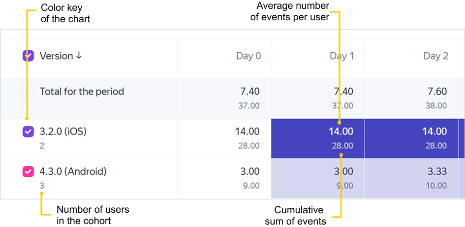
- Average number of events per user
- This metric is calculated as the ratio of the cumulative sum of events on Day N to the number of users in the cohort.
- Cumulative sum of events
- This metric is calculated for Day N as the total number of events for that day and all previous days in the selected period.
The report interface also displays the following:
- The color key of metrics on the chart. Use it to show or hide a metric on the chart.
- The total number of users in the cohort.
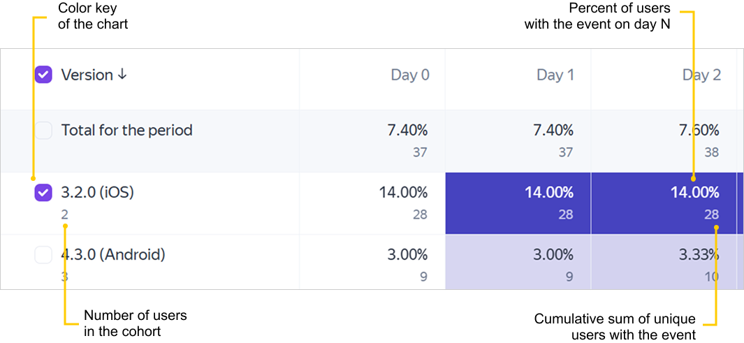
- Percentage of users completing the event on Day N
- This metric is calculated as the ratio of the cumulative sum of unique users on Day N to the total number of users in the cohort.
- Cumulative sum of unique users completing the event on Day N
- This metric is calculated for Day N as the total number of unique users for that day and all previous days in the selected period. If the user has completed the event several times in the selected period, the event is counted only once.
The report interface also displays the following:
- The color key of metrics on the chart. Use it to show or hide a metric on the chart.
- The total number of users in the cohort.
Total revenue from advertising monetization, in-app purchases, and in-app subscriptions for the reporting period. Learn more about currency conversions.
- ARPU
- This metric is calculated as the ratio of cumulative revenue on Day N to the number of users in the cohort.
- Total revenue
- Total revenue for Day N is calculated as the total revenue for that day and all previous days in the selected period.
The report interface also displays the following:
- The color key of metrics on the chart. Use it to show or hide a metric on the chart.
- The total number of users in the cohort.
Total revenue from in-app purchases and in-app subscriptions. Learn more about currency conversions.
- ARPU
- This metric is calculated as the ratio of cumulative revenue on Day N to the number of users in the cohort.
- Total revenue
- Total revenue for Day N is calculated as the total revenue for that day and all previous days in the selected period.
The report interface also displays the following:
- The color key of metrics on the chart. Use it to show or hide a metric on the chart.
- The total number of users in the cohort.
Total revenue from advertising monetization for the selected period.
- ARPU
- This metric is calculated as the ratio of cumulative revenue on Day N to the number of users in the cohort.
- Total revenue
- Total revenue for Day N is calculated as the total revenue for that day and all previous days in the selected period.
The report interface also displays the following:
- The color key of metrics on the chart. Use it to show or hide a metric on the chart.
- The total number of users in the cohort.
The number of users who made at least one in-app purchase or subscription during the selected period.
- Percentage of paying users
- This metric is calculated as the ratio of the number of paying users on Day N to the total number of users in the cohort.
- Number of paying users
- The total number of paying users for Day N and all previous days in the selected period.
The report interface also displays the following:
- The color key of metrics on the chart. Use it to show or hide a metric on the chart.
- The total number of users in the cohort.
The number of in-app purchases and subscription events with positive revenue.
- Purchases per user
- This metric is calculated as the ratio of the number of purchases on Day N to the number of users in the cohort.
- Number of purchases
- The total number of purchases for Day N and all previous days in the selected period.
The report interface also displays the following:
- The color key of metrics on the chart. Use it to show or hide a metric on the chart.
- The total number of users in the cohort.
Data export
You can export data by choosing an item from the Export dropdown list above the chart.
The data is exported based on the selected report settings: segmentation, dimension, and time period.
In the upper-right corner click  and select the action:
- Chart as PNG — Exports the chart image in the
PNGformat.
If you didn't find the answer you were looking for, you can use the feedback form to submit your question. Please describe the problem in as much detail as possible. Attach a screenshot if possible.
A group of users who share a characteristic and the date of when they completed a target event. The shared characteristic may be an app install or a target event.