Report Builder
The Report Builder is used to work with reports in the Boost ad monetization module. You can access the Report Builder from the Ad Monetization section or from the report list of the Analytics module:
- Ad Monetization → Report builder.
- Reports → Ad monetization.
Saved reports appear in Reports → Saved.
You can open reports for a specific app or ad unit from the page listing apps or ad units. Find the one you need and click Statistics.
For more information about managing reports in Boost Analytics, see the relevant section of the Analytics module.
Creating a report
Step 1. Choose a report template or create a custom report
You can create a report manually in Ad Monetization → Report builder or choose a report template from the list in the Reports section. If you can't find a perfect template, select the most relevant one. You can add more parameters later.
Note
To create a Yandex Mediation report, add the appropriate filters. You can select filters by app, placement, and monetizer.
Step 2. Choose a currency and time zone
By default, all financial metrics are shown in dollars, and the time zone is determined by your Yandex ID profile settings.
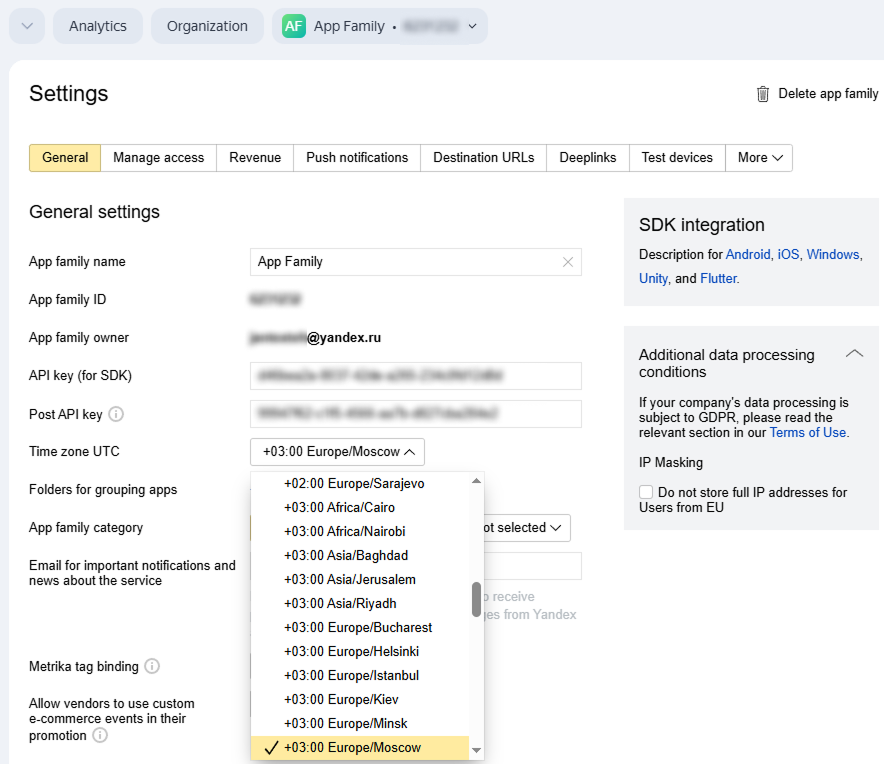
To change the time zone:
-
On the Boost home page, click the dropdown list at the top and select the app family for which you want to change this setting.
-
Go to Settings → Main.
-
Choose the desired value in the Time zone UTC dropdown list.
What it looks like
In Boost reports, financial metrics factor in the corresponding values from the YAN, Yandex Mediation, and AppMetrica in your selected currency. To change the currency:
-
Go to Report builder.
-
Click
 and select a currency.
Values appear in your specified currency in both new and previously saved reports.
Note
If you receive revenue in dollars or euros, the revenue amount in the report may differ from the amount paid. This is because revenue is calculated in rubles and converted into another currency at different rates:
- For statistics: At the exchange rate of the Central Bank of Russia as of the impression date.
- For payment: At the exchange rate of the Central Bank of Russian as of the last day of the reporting period.
Example of calculating revenue in dollars
Let's assume you receive revenue in dollars. In September, your impressions generated:
- September 9: 200 rubles.
- September 16: 240 rubles.
- September 23: 260 rubles.
- September 30: 280 rubles.
How monthly revenue is calculated in reports
|
Impression date |
Revenue in rubles |
Exchange rate of the Central Bank of Russia as of the impression date |
Revenue in dollars (in the report) |
|
September 9 |
200 |
50 rubles/$ |
$4 |
|
September 16 |
240 |
60 rubles/$ |
$4 |
|
September 23 |
260 |
65 rubles/$ |
$4 |
|
September 30 |
280 |
70 rubles/$ |
$4 |
|
Total for the month |
980 |
— |
$16 |
How the payment is calculated
Your total monthly revenue (980 rubles) is converted to dollars at the exchange rate of the Central Bank of Russia as of the last day of the reporting period (September 30):
980 rubles / 70 rubles per $1 = $14
The difference between the remuneration amount in the report and the amount paid is $2.
Step 3. Specify the report dates
Select the report period from the dropdown list at the top of the screen or specify the desired dates in the calendar, then click Apply.

To compare reports for two different periods:
- Specify the dates of the first period in the calendar.
- Select Comparison → With previous period next to the calendar. Another period appears.
- Select the dates for the second period, then click Apply. Your changes will appear on the chart.
Step 4. Configure dimensions, metrics, and filters
If you're using a template to create your report, the main parameters will be set automatically. You can always add new parameters or remove parameters that are already in place.
If you're creating a report from scratch, you will need to set all the parameters manually.
Determine the parameters that the report data is grouped by.
To add a dimension parameter:
-
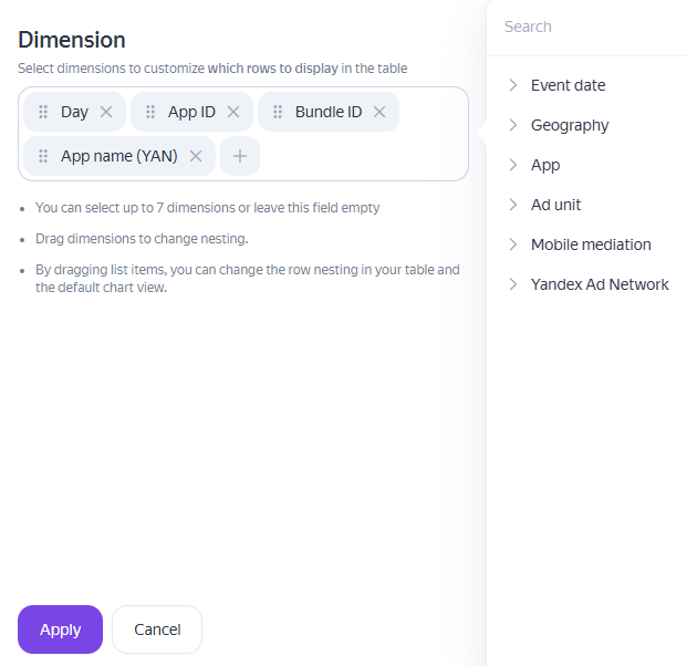
Click Dimension above the chart.
-
A window with dimension settings opens. Click
 in the dimensions section and select the desired values from the list.
Note
You can select up to 7 dimensions or leave the field empty.
-
Click Apply.
Your selected parameters appear in the Dimension window. When a report is generated, dimensions are applied in the order they're listed in the settings. You can rearrange dimensions in the modal window by clicking and holding a dimension's name and dragging it to the desired position. You can remove any elements you don't need by clicking  .
.
Statistical metrics that you want to check for the selected data range.
To add a metric:
-
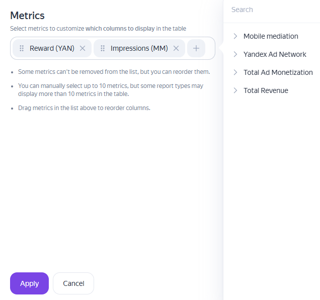
Click Metrics above the chart.
-
A window with metric settings opens. Click
in the metrics section and select the desired values from the list.Note
You can manually select up to 10 metrics in addition to the defaults for your report type. Some metrics can't be removed from the list, but all metrics can be moved.
-
Click Apply.
Your selected metrics appear in the Metrics window. When generating a report, metrics are displayed in the order they're listed in the settings. You can rearrange metrics in the modal window by clicking and holding a metric's name and dragging it to the desired position. You can remove any elements you don't need by clicking .
Click Apply.
Filters define the data that your report will be based on. You can filter data by a specific app, ad unit, platform, name, whether particular values are included or excluded, and other parameters.
To add a filter:
-
Click Segment → Custom segment.
-
The filter bar will appear. To open the list of available filters, click Add condition.
-
Select the parameter to filter the report data.
-
Specify a value for the selected parameter: choose from the dropdown list or enter it manually. To remove a selected value from the filter, click
=. The icon will change to≠.To delete a filter, click
 .
. -
Click Apply.
To reset all your filters, click Reset segment.
Clicking Apply updates the report and the chart with your changes.
Report setup example
Let's say you need to find out your expected revenue from serving ads in ad units for a week. To create this report:
-
Filter the data so that only ad units are displayed. To do this, click Segment → Custom segment, switch to YAN → Product, and select Ad unit type. Select In-app ad units from the list.
Click Apply.
-
Choose dimension parameters for your metrics.
For example, to see which apps generate the most revenue, you can group the data by app ID or name. Add the corresponding dimensions, Bundle ID or App name, then click Apply.
-
Select the following metrics: Viewable impressions and Revenue. Click Apply.
-
Group the data by day. This way you can track the change in revenue and the number of impressions during the selected week.
What report settings look like
Viewing a report
The report is available as a chart and a table.
You can view the chart as a line, bar, or pie chart. To change the chart type, use the  buttons above the chart.
Configure the chart's level of detail using the dropdown list next to the metrics. You can set the granularity to 10 minutes, 1 hour, or 1 day.
The horizontal axis displays the following information:
- For line charts: dimensions by period.
- For bar charts: dimensions by category.
To remove a dimension from the chart, disable it in the dimension window.
The metric values are on the vertical axis. You can choose metrics to display using the metrics window above the chart.
If you don't need the chart, you can hide it by clicking  . In addition, you can change the chart's size. Available options are S (160 px), M (280 px), and L (420 px).
You can choose the table type:
- Simplified data table.
- Hierarchical table with grouped data.
Hierarchical tables display structured data, with low-level items nested inside higher-level items. Click  to switch from a simplified table to a hierarchical table.
You can sort the table data by any column — just click the column header. The data will be sorted, and an arrow icon (↑ or ↓) will appear next to the column header, showing the sort direction. You can sort the following data:
- Parameters with a numeric value may be sorted in descending or ascending order.
- Parameters with a text value may be sorted alphabetically.
To reorder columns, change the order of metrics or dimensions in the report settings.
In addition, you can switch the table view between absolute values and percentages using the  toggle and find nested parameters and dimensions using the search bar.
Saving a report and chart
In the Boost interface, you can:
- Save reports in CSV format.
- Save charts in CSV or PNG format.
- Copy API requests for a chart or report (table).
To select an option, click  next to the report name.
More report actions
Use the options next to the report name to:
Add the report to your dashboard:
- Add to workspace adds the report, chart, or metric to your selected dashboard or widget for quicker access. In the window that opens, you can customize which metrics, dimensions, and filters to display in the dashboard or widget.
Save the report in the interface:
- Save as... allows you to name the report and save it under Reports → Saved.